“A state-of-the-art Profit Response Planning Platform designed for global, regional, and local use for Pharma Commercial Excellence teams to integrate Business Financial Strategy with Operational Promotional Planning”
The look and feel of the application are meant to ease the office work and increase the Field Force Effectiveness. The gamification and the style were there when I joined the team and I helped designing parts of it and to continue the rest of the project.
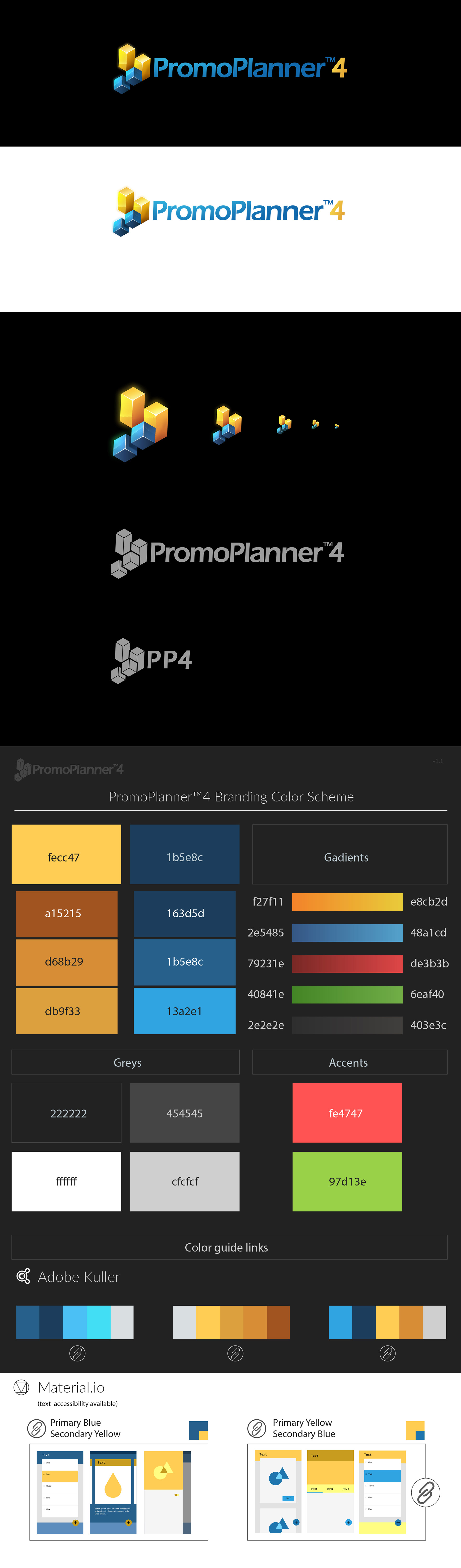
Style: skeuomorphic, playfull, color
Apps used: Photoshop, Sketch, InVision, Unity, Principle
Apps used: Photoshop, Sketch, InVision, Unity, Principle
On this project, I prepared the previews of each screen, the sprites, and states, worked on several characters and mostly every avatar. Also, some elements needed sprites for animation and I did that sometimes manually in Photoshop or by using Principle. I mapped sprites in unity (with a better workaround) and animated behaviors of several elements (Planning board) in Unity.
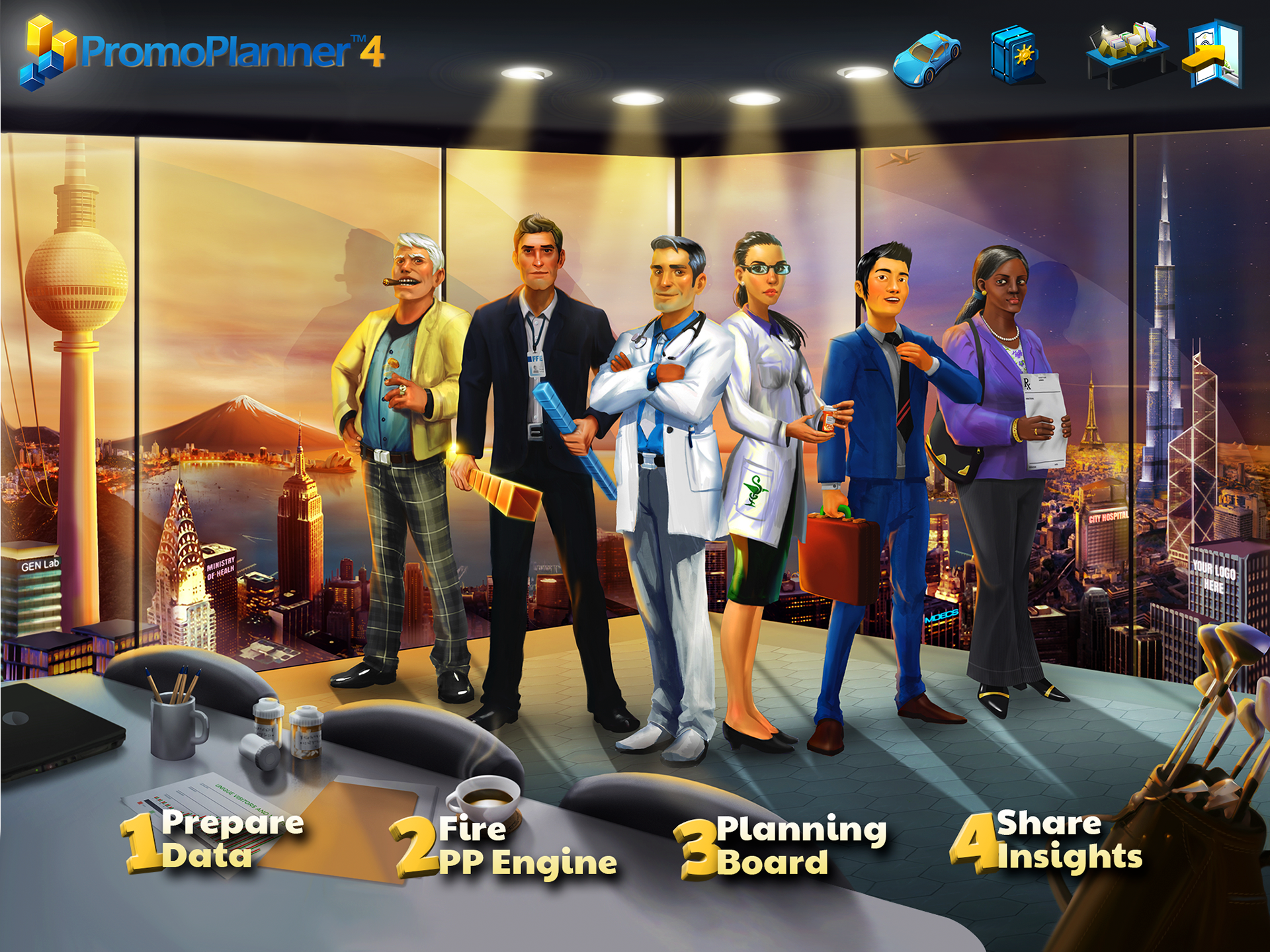
Divided into several steps (screens) PP4 is intentionally creating different visual aspects so the user can relate with the type of work involved:
The main screen shows the user the steps in developing a project but also the license, save import and exit options. The background shows characters relevant to the industry dynamic and landscape made of famous landmarks in the world creating a sense of global community. This screen is also relevant to the second step:
The Fire PP Engine is the calculation period that can vary from a few seconds to several minutes. This is where the user waits and discovers graphical elements in the background. Much like an easter egg, the background contains graphical elements - placeholders for logos and animation. The process ends with a firework spectacle with a skyscraper view.
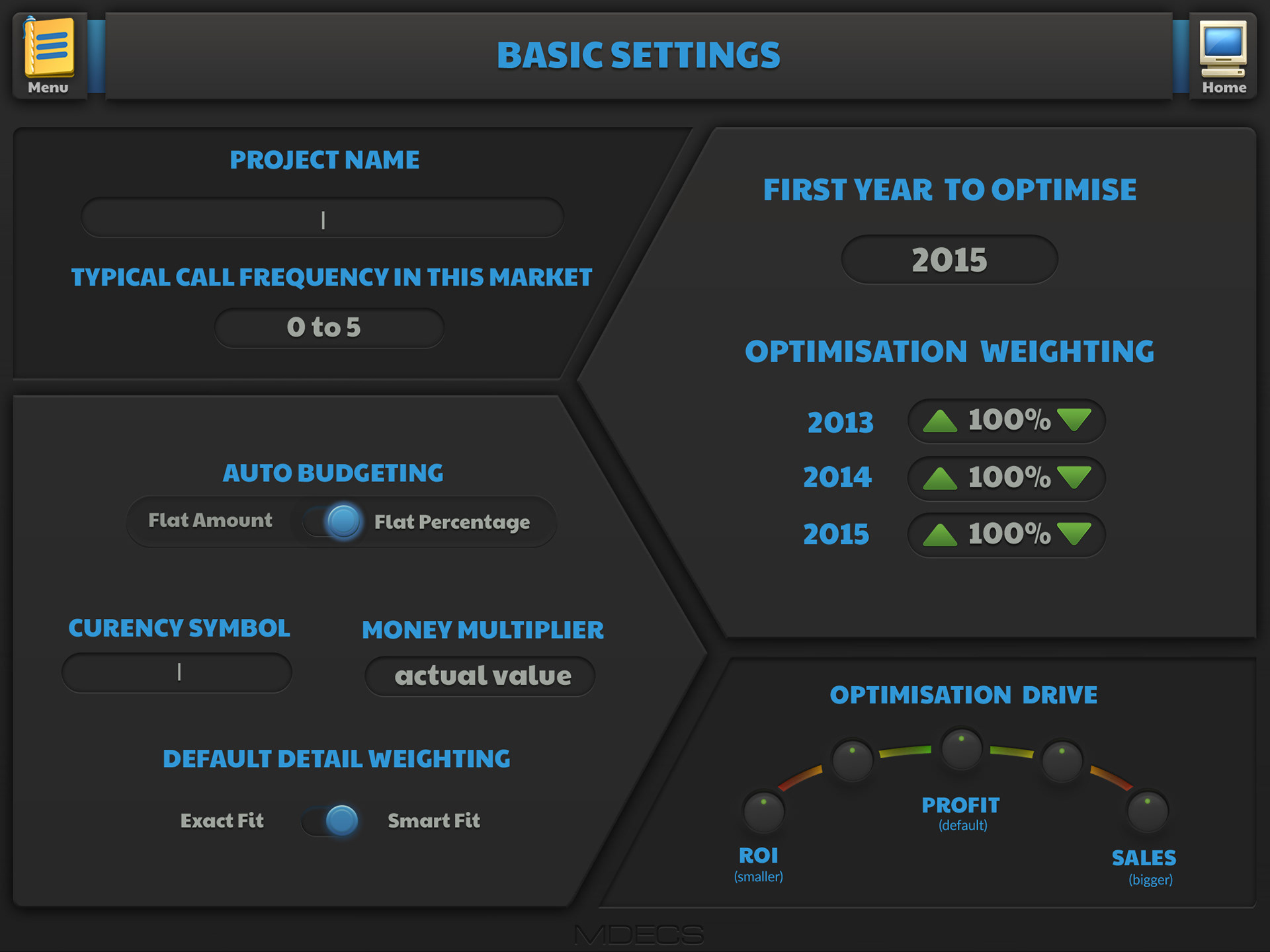
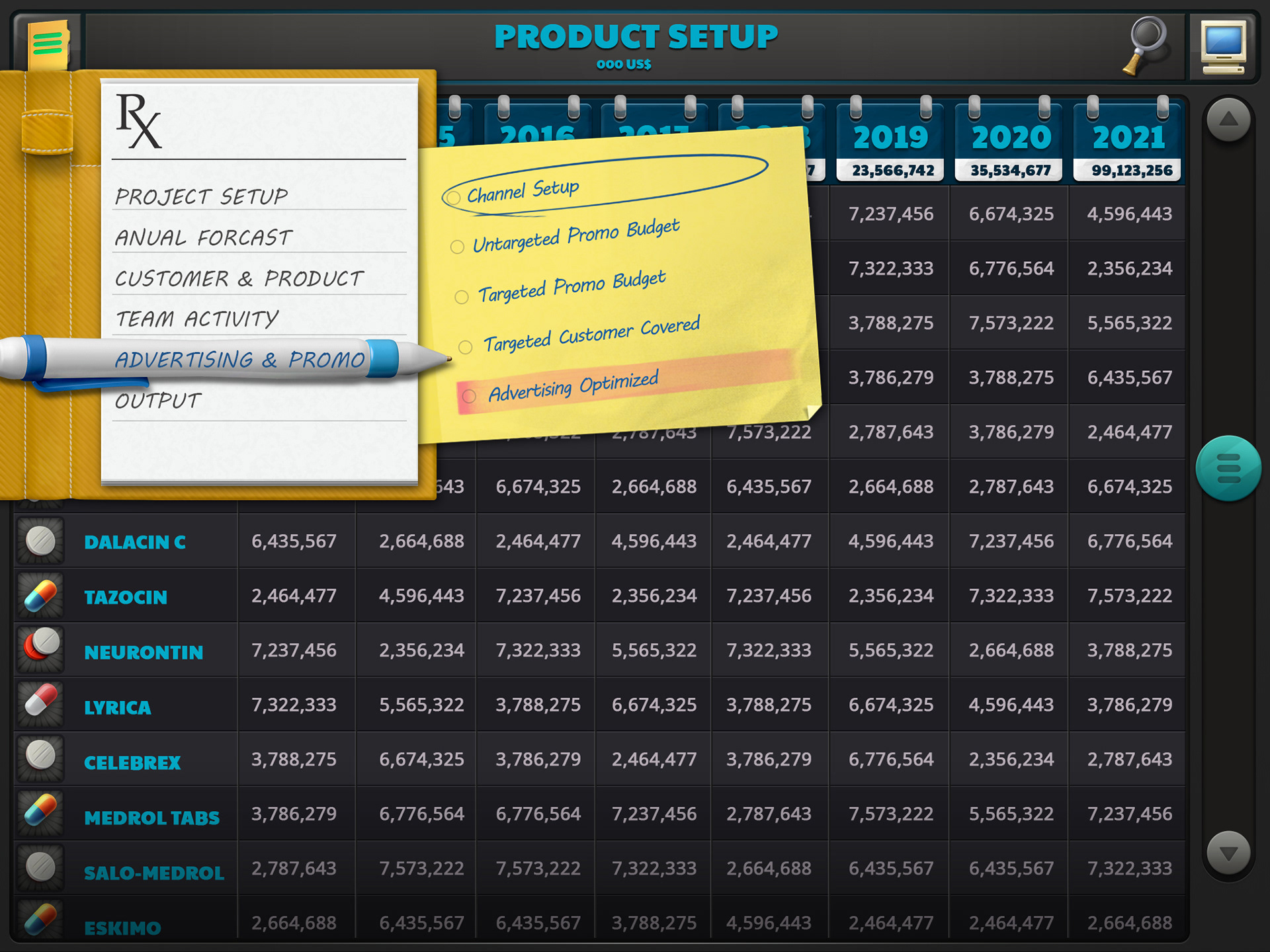
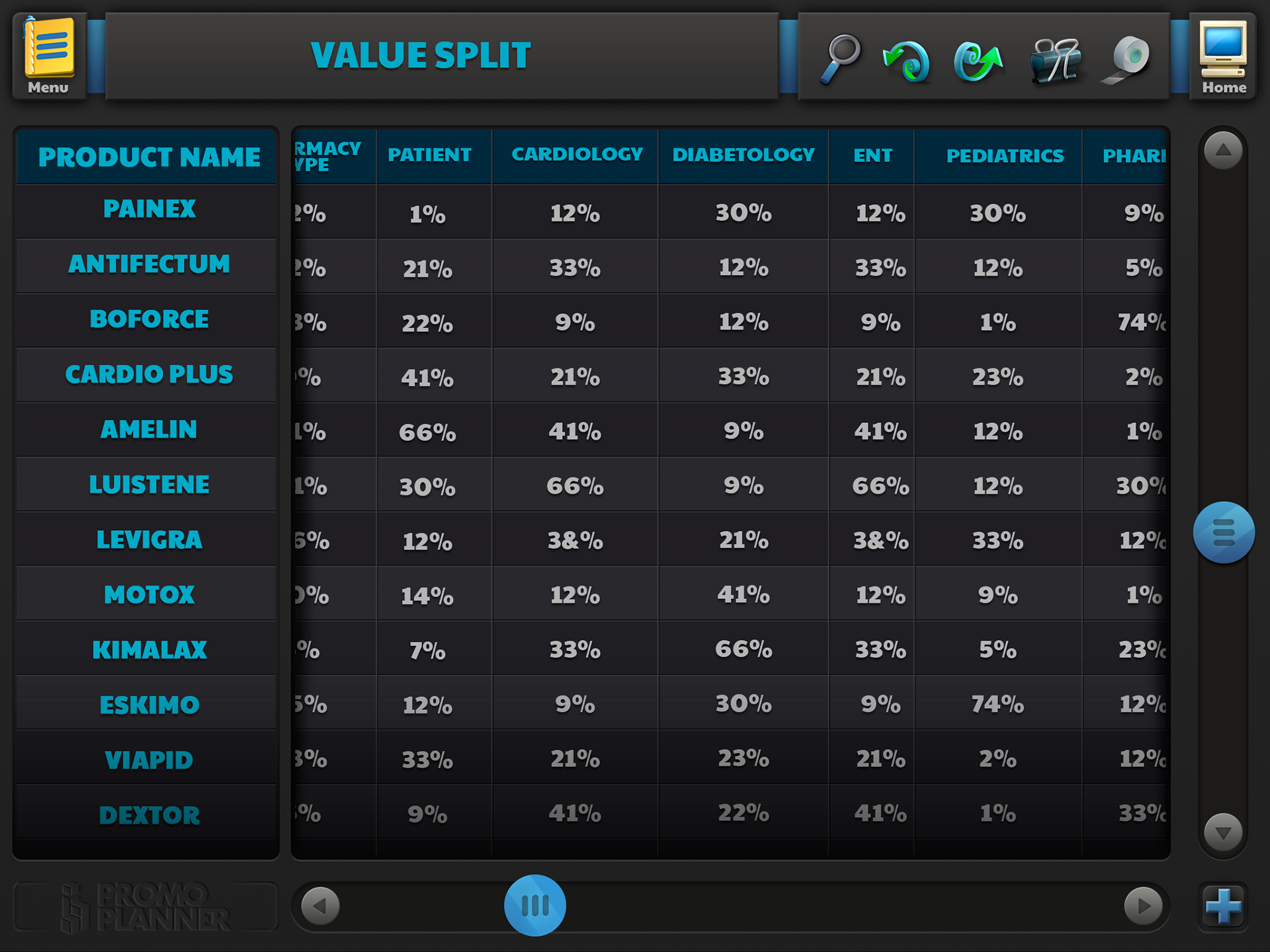
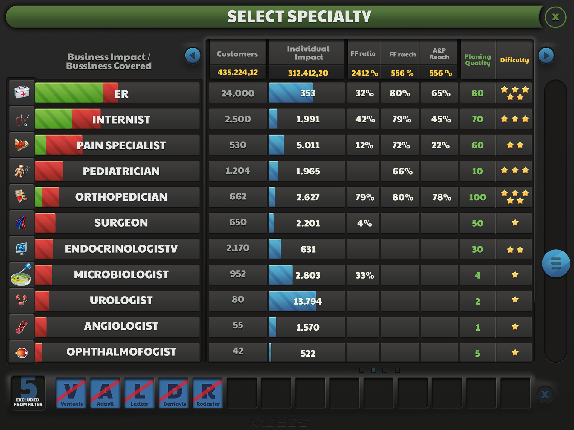
Data forms - the section where the user inputs the data, chooses the avatars, define the settings for the entire project. The looks and feel compared with the other screens are more simple but still more fun than the usual Excel-sheets. In the RX menu, the illustrations will later relate to the meaning of each category.
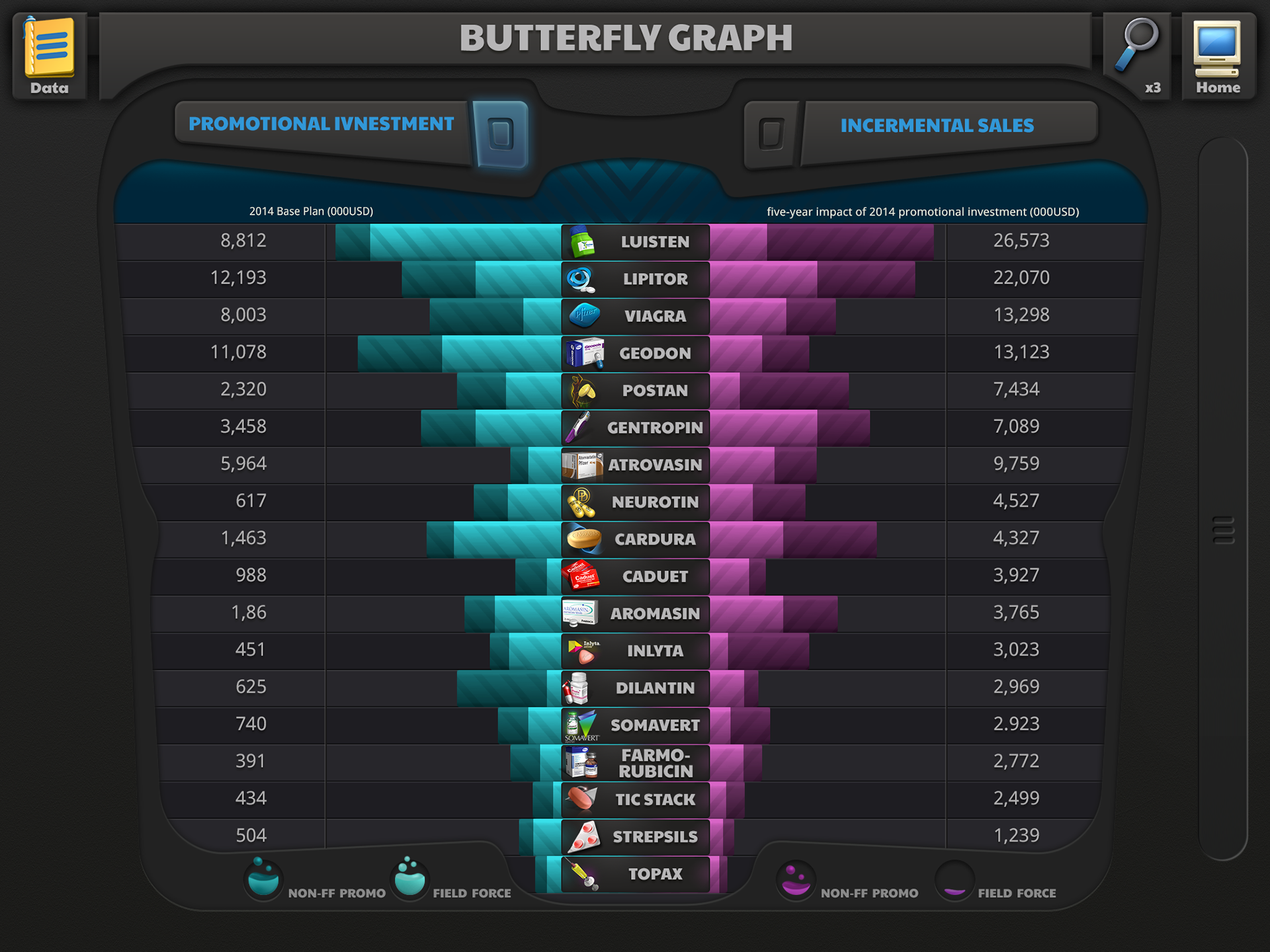


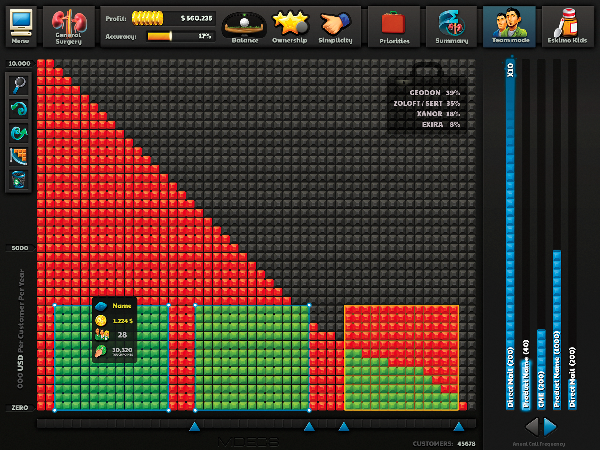
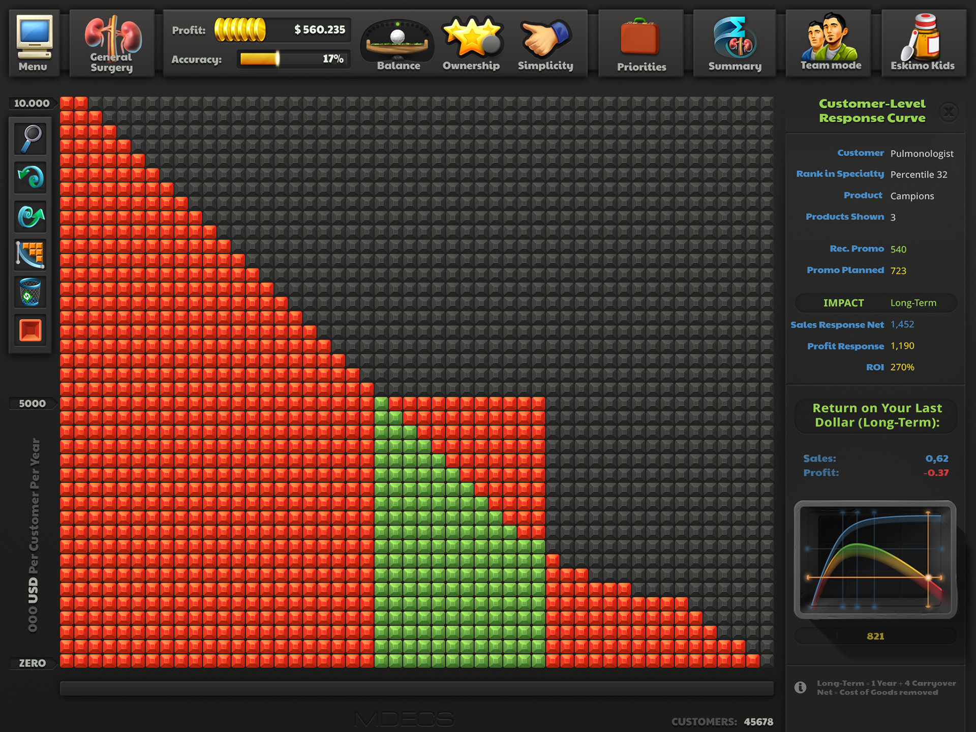
The Planning Board is the place where the user can have some fun and play with chunks (of money) and connect to the visual aspect of all the investments, through any channel. The user can also go deeper and tweak on any team, product and specialty they initially defined previously in Data Forms. Choosing one of them, areas of the screen can change, mostly in the right area, but also in-depth screen would show on top.
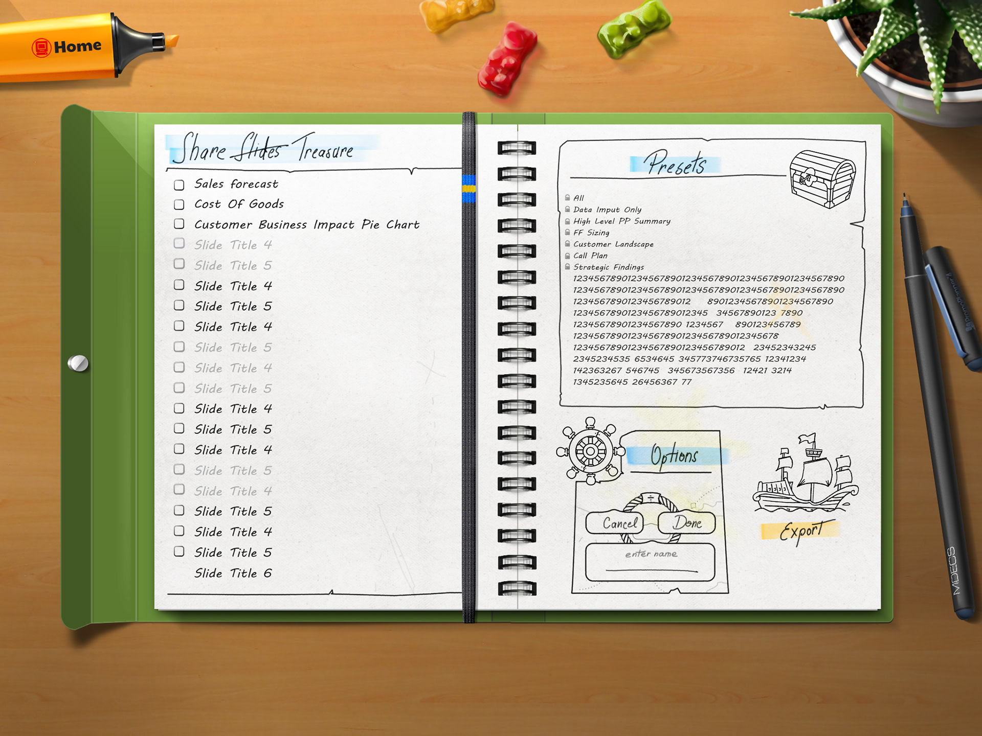
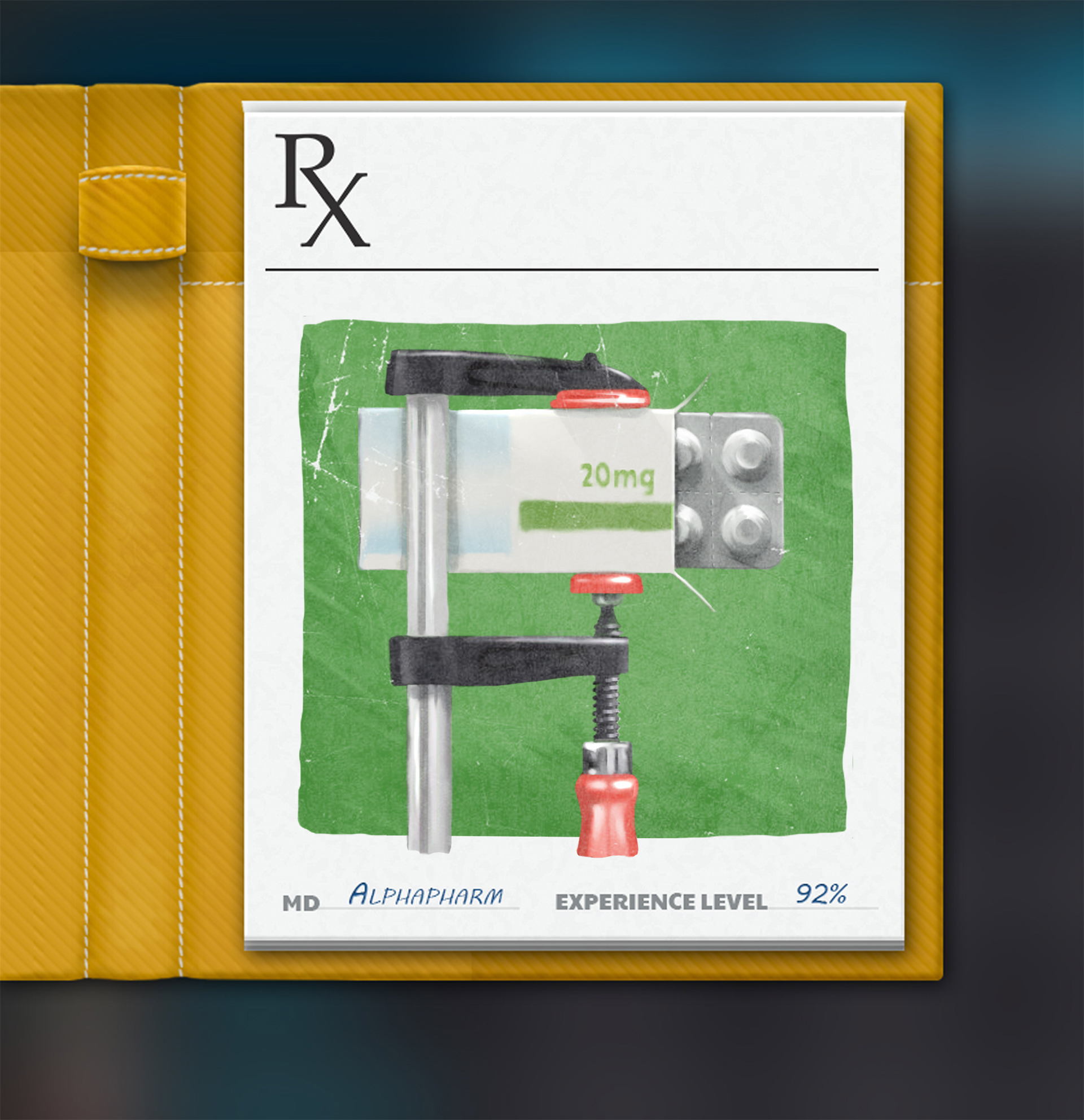
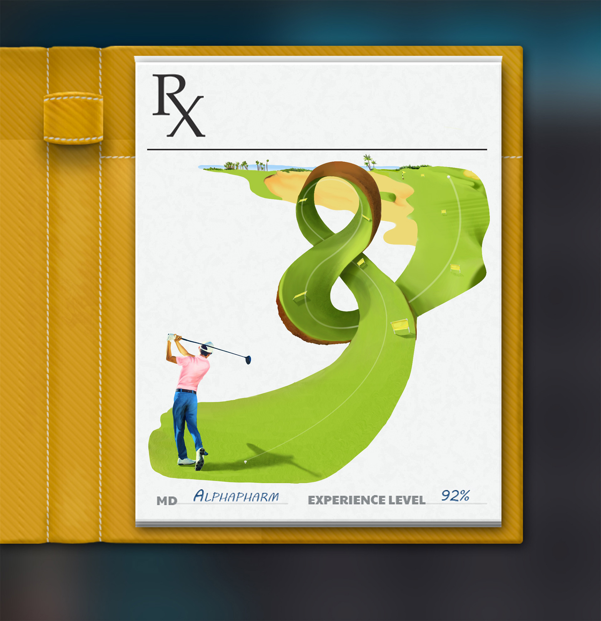
The last step, Share Insights is meant as a way out of the digital world - the notebook on the desktop. This is where the user exports the results of the planning in power-point sheets for further presentations. The Rx illustrations are correlated with each output in this section. The user can choose from the default ones, or create new custom ones. They are defined as treasures or findings to give a sense of accomplishment. The theme continues for the last clicks in the popup menu which is a hand holding the phone where the user picks the saving location.